Agentic navigation: when the portfolio must be legible for AI
Published on
I ran Lighthouse on my portfolio and found a new category with a critical score: agentic navigation. What it evaluates, what my site was missing and why it changes design.

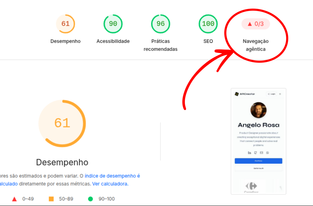
I have the habit of running Lighthouse on my projects from time to time. It is the Google tool that scores performance, accessibility, best practices and SEO. Last time, on my own portfolio, a category appeared that I had never seen: Agentic navigation.
The score was 29 on mobile and 66 on desktop. A new item, in red, right on the site that presents my work. I went to understand what it was.
What agentic navigation is
"Agent" is the name given to AIs that not only answer questions but act: they open sites, read pages, compare information, fill in forms and summarize what they found for someone. Think of a recruiter who asks an assistant "analyze this person portfolio and tell me what kind of product they have worked on". In that case, the visitor is the agent.
The difference that matters for anyone who designs: an agent does not see the interface the way we do. It does not read a three line icon as a menu, nor does it understand that large bold text is the page title. It reads the structure: element names, content hierarchy, what is a link and what is a button, what is a decorative image and what is information.
It is the same layer assistive technologies such as screen readers have used for years. The accessibility we often treat as a checklist item becomes the entrance door of your product to a new category of visitors.
How the score is built
Today Lighthouse considers three criteria, with the same weight, in agentic navigation:
Does the page structure make sense to a machine? Does every button have a name, does every control say what it does?
Is there an llms.txt? It is a simple text file that works as a presentation of the site for language models: who it is, what it is about and which are the main pages.
Is the layout stable while loading? Elements that "jump" around disturb both the person and the agent trying to click something.
Google itself warns that the category is still under development.
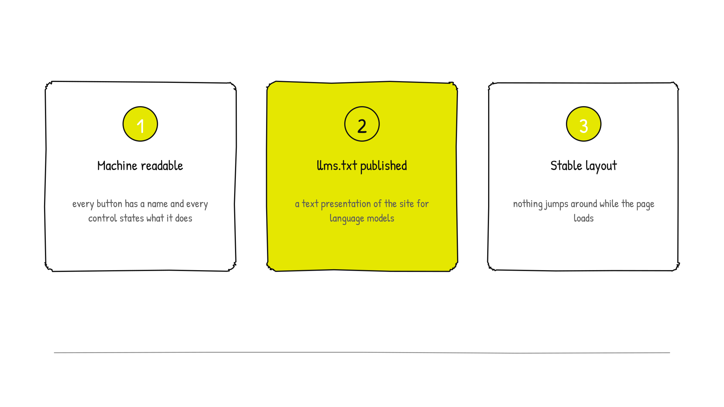
Even so, the three criteria point to fundamentals that already hold today.
What I found in my portfolio
A button with no name
On mobile, the menu opens through a button with a hamburger icon. Visually, zero doubt. In the page structure, however, it was a button with no name at all, a mute box.
It is a classic case of visual affordance without semantic affordance. We design the icon, the hover state, the open state, and we forget to say, in text, what that control does. On desktop the problem did not show up because the full menu stays visible, and that explains the score difference between the versions.
Reviewing the rest of the site with that lens, I found other similar cases:
Links behaving as buttons. "View project" opened the case site, but was built as a button. For an agent, there was no destination to follow.
Language switching was an action, not a path. The English version existed, but it was not "discoverable".
The client logo carousel repeated the list to create the infinite scroll effect. For anyone reading the structure, it was 14 clients instead of 7.
Clickable images with no indication that they were clickable nor of what happens on click.

A business card that did not exist
I did not have an llms.txt. And there was a curious detail: when accessing the address where the file should be, the site returned its own home page. For the test, it was like asking for a document and receiving a brochure about something else.
I like to think of llms.txt as a briefing of the site for AI: a summary of who I am and what I do, the list of projects with client, year and skills, the institutional pages and the articles. It is content, not code, and writing it well is an information architecture exercise.
A layout that jumped
The home showed a skeleton while loading the texts. The intention was good, but the skeleton proportions did not match the real content: when the text arrived, the buttons moved down. The carousel logos also had no reserved space and pushed the content when they appeared.
It is a reminder that skeleton is design. It needs to have the shape of what it replaces, otherwise it becomes a source of instability.
The problem the report did not show
With the three points fixed, I asked a question Lighthouse does not answer: what does a robot that does not execute JavaScript see on my site?
My portfolio is a React application, built with help from Lovable. In this type of site, content is "assembled" in the browser after the page opens. For a person, everything appears normally. Many AI and social robots, however, only read the page in the state it arrives from the server, without assembling anything.
What they received was an empty page, with the title "Projeto Web Base" and the share image from the original template. No project, no client, no contact. It was like having a well assembled shop window, but with the service door opening into an empty room.
That also affected the preview of links shared on LinkedIn and WhatsApp, exactly where a portfolio circulates the most.
What changed
With the help of a code AI for the implementation, we made the changes without altering the site visual and without breaking my editing flow in Lovable:
In the interface
Every icon only button received a descriptive name ("Open menu", "Close", "Next image").
What leads somewhere else became a real link; what executes an action stayed a button.
Language switching became a real path to the English version.
The carousel repetition became invisible to anyone reading the structure.
The home now shows content from the first instant, without the oversized skeleton, and images received reserved space.
The colored category badges, which used colors too light to read, now adjust the text tone automatically to reach the recommended minimum contrast, without losing the color of each category.
In the layer AI reads
The site gained an llms.txt generated automatically from the content, always up to date when I publish a project or an article.
Robots and agents now receive each page already rendered, with the same content people see: texts, projects, clients, years and skills.
Each page gained its own title and description, which also appear in sharing previews.
Structured data was added: a kind of invisible technical sheet that explicitly says "this is the profile page of Angelo Rosa, Product Designer" or "this is a design case".
A sitemap, the Portuguese and English versions signaling each other and a "not found" page that reports the error correctly.
In page weight
Along the way I discovered that the case covers were images of more than 1 MB displayed in 400 pixel cards. With automatic optimization, each cover went from up to 1.3 MB to around 16 KB, with no visible loss. A light page is good for anyone on mobile and also for an agent with limited time to read the site.
The result
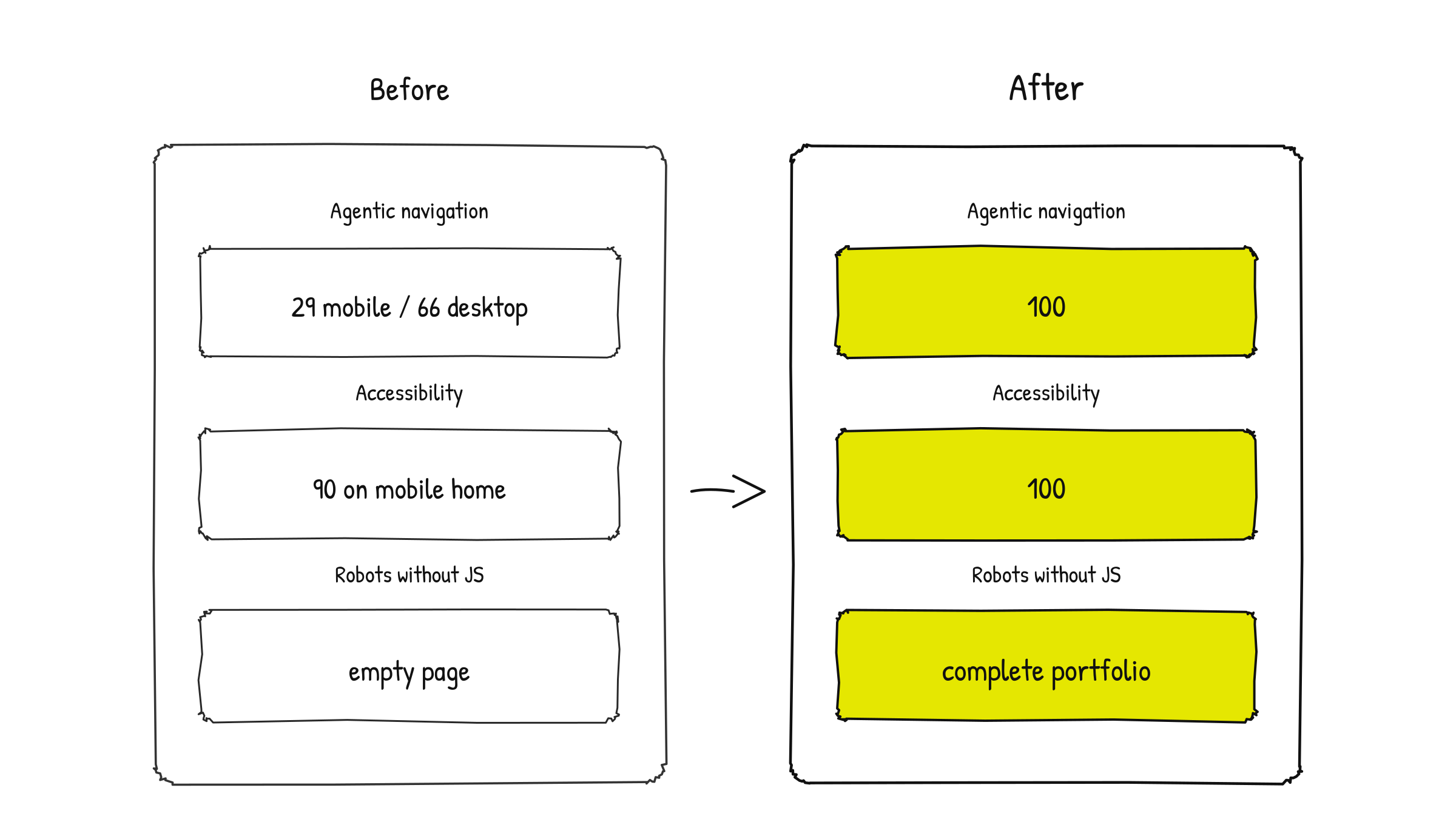
Agentic navigation: from 29 (mobile) and 66 (desktop) to 100 on the tested pages.
Accessibility: from 90 to 100 on the mobile home.
Robots without JavaScript: from an empty page to the complete portfolio.
More than the scores, the site now communicates the same thing to both audiences: people and agents.
What this changes in our work
I leave this process with a few convictions that hold for any digital product, not only portfolios.
We design for two audiences. The visual interface remains for people. But there is a second interface, the structural one, which has always existed for assistive technologies and is now also read by agents. It deserves the same care.
Accessible name is part of the component. In the design system, an icon only button should come with the "label" field specified, the same way we specify size and state. If the handoff does not state the button name, someone will leave it blank.
Link and button are not the same thing. Visually they can be identical, but semantically one leads to a place and the other executes an action. That distinction needs to be clear in design, not only in code.
Loading states need proportion. Skeleton, placeholder and reserved image space are design decisions that affect screen stability.
Metadata is also UX writing. The page title, the description that appears when shared and the summary in llms.txt are content, and they are often the first contact someone, or something, has with your work.
AI tools for building require reviewing fundamentals. Creating a site with AI is fast and powerful, but the result inherits template choices: the default title, the component without label, the page that only exists after JavaScript. It is worth reviewing with the same rigor we apply to any delivery.
Agentic navigation is still evolving, but the message is already given: our products are now also read by agents. And, curiously, the best way to prepare for that is to go back to the basics accessibility has always defended.