Carrefour: SVA+ Price Comparison Design
Development of a product comparison feature inside the SVA+ app, enabling Carrefour Brasil sales associates to view up to three items side by side in real time, optimizing the sales experience and generating over 15,000 comparisons within the first three months.
- Client
- Carrefour
- Year
- 2023
- Categories
- UI / Product Design

Challenge
The purpose of SVA+ is to allow sales associates to perform electronics sales consultations directly in front of customers using the corporate smartphone.
One of the most valuable planned features was a specifications comparator, enabling up to three items from the same category to be displayed side by side for clearer visualization and analysis of technical characteristics.
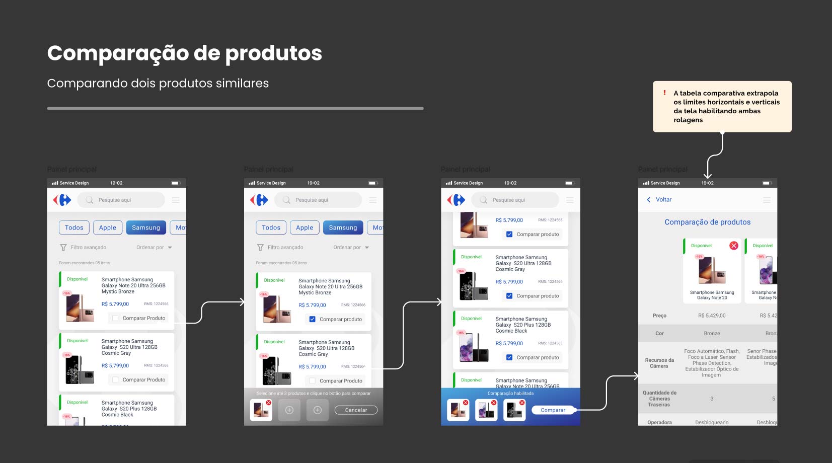
The main requirement was that the seller could select up to three products from the same category, view their specifications in parallel columns, and facilitate customer decision-making at the moment of sale.
Solution
The first step was to map all product categories and identify the relevant characteristics for comparison. These specifications ranged from short texts to more detailed descriptions.
With this mapping in hand, I conducted a benchmark analysis to study how major e-commerce platforms—such as Amazon, Buscapé, and Mercado Livre—structured their comparison tools. The goal was to identify which approaches would work best in our context and which ones should be discarded.
Based on these references, I prototyped the comparison journey within the app. The flow was defined as follows: the seller accesses a product detail page, selects the option to compare it, and then an item with the product thumbnail appears in the fixed footer of the screen.
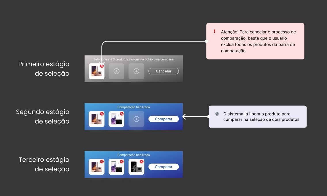
This footer remains visible throughout the navigation, allowing the user to add up to two additional products. Once two or more items are selected, the “Compare” button becomes available.
When the user initiates the comparison, a table is displayed with columns corresponding to each product and rows filled with their respective specifications. Both horizontal and vertical scrolling allow for clear reading of characteristics side by side.
User Testing
To validate clarity and flow of the experience, we exported the prototypes to the Maze platform, which allowed us to track clicks, response time, heatmaps, and task completion rates.
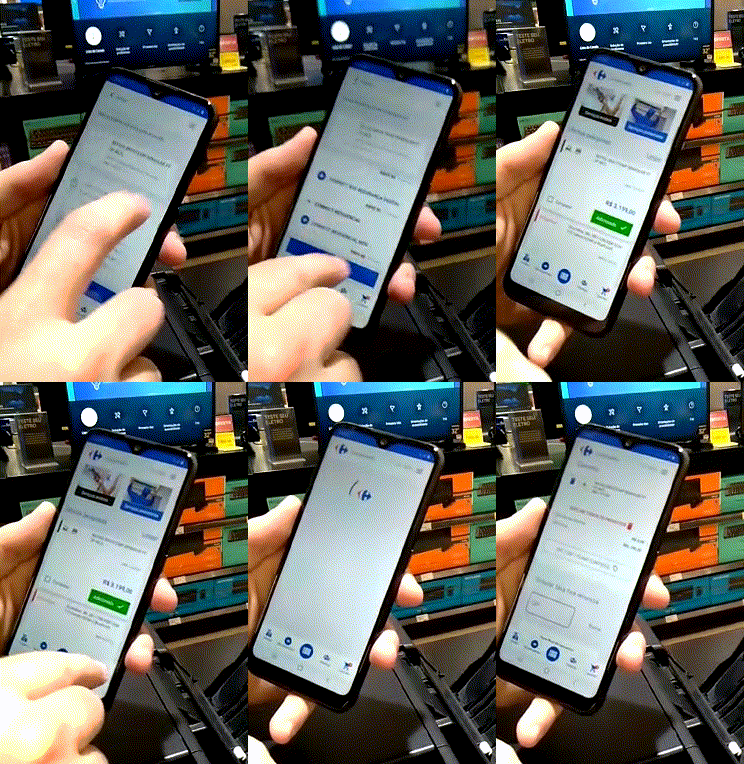
The tests were conducted with 10 sales associates from different profiles, each using the same phone model used during sales activities.
Main findings:
There was no friction when selecting the first product to start the comparison.
The bottom bar was too discreet and needed more visual emphasis.
The remove button for a selected product was not sufficiently visible.
All participants completed the comparison within the expected time.
After the first attempt, completion time dropped to the expected range.
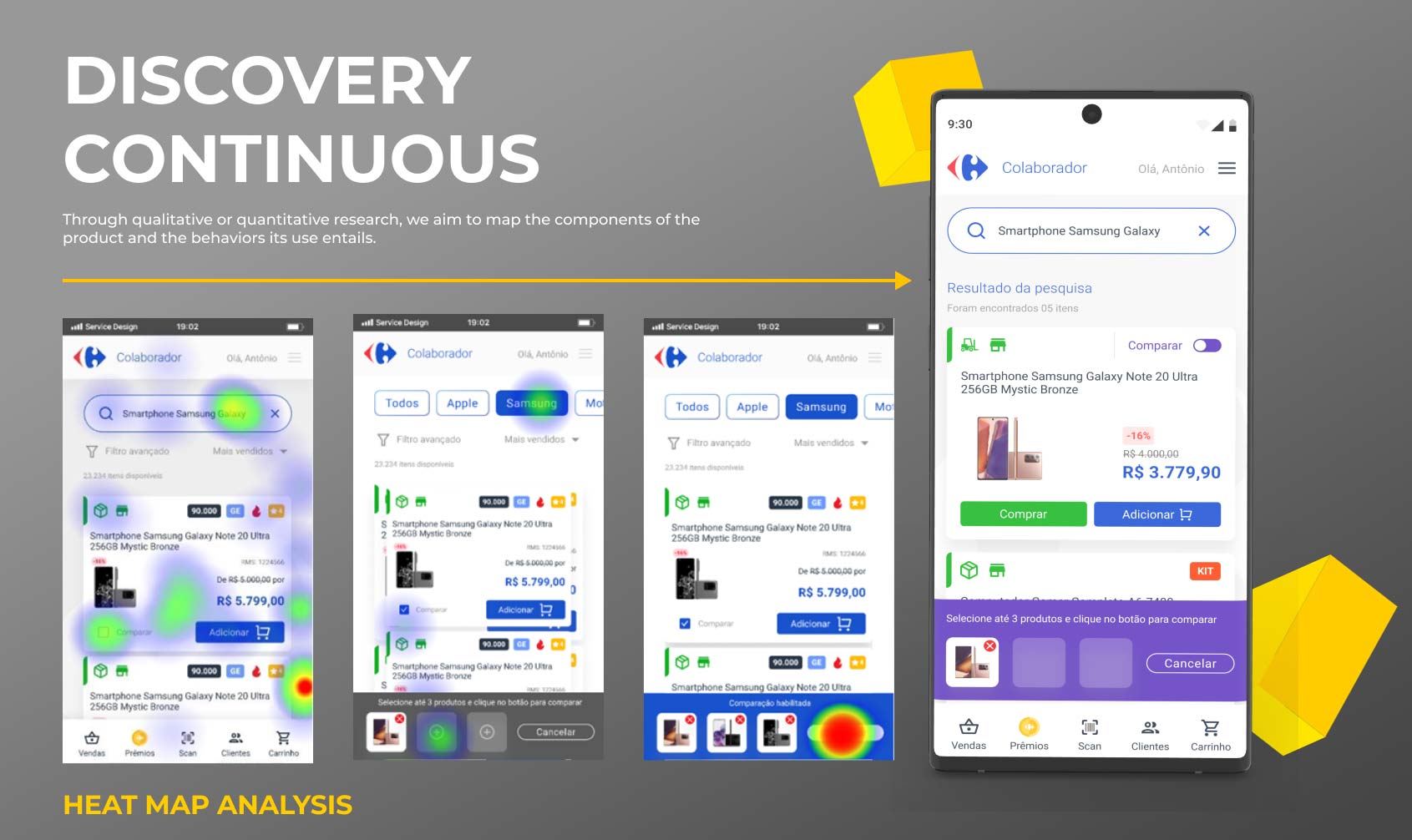
Based on this feedback, we implemented UI and UX adjustments to improve element visibility and usability. After final validation, the feature was launched to all Carrefour Brasil sales associates, resulting in over 15,000 comparisons in the first three months.