Platform Builders: Institutional Website Design
Creation of the new institutional website for Platform Builders, led by a multidisciplinary team focused on reflecting the company's culture and presenting its portfolio in a modern and strategic way. The initiative resulted in an innovative portal with a responsive design, advanced technological integration, and significant growth in traffic shortly after launch.
- Client
- Platform Builders
- Year
- 2023
- Categories
- UI / Product Design
Challenge
As is common in software development companies, the designers and developers at Platform Builders focused all their effort and talent on client projects, without prioritizing their own communication materials and institutional website.
As Lead Designer, I was tasked with leading the multidisciplinary team responsible for developing a definitive website that would reflect the company's culture and personality, as well as creatively showcase its entire portfolio of services to the corporate market.
Solution
The project began with an internal workshop to define the tangible goals the new portal needed to achieve. Several meetings were held with the company’s strategic sector, partners, C-level executives, business unit heads, and key employees.
Based on this research, I was able— for the first time in the company’s history— to map out all departments, their objectives, offerings, and work methodologies. This became the foundation for defining the website’s structure, strategy, and content.
After this phase, I began synthesizing this large amount of information into a rich and coherent hierarchical structure. We defined the website sections and all the content that would be included. It became clear what type of communication approach we should use to clearly illustrate all of the company’s offerings.
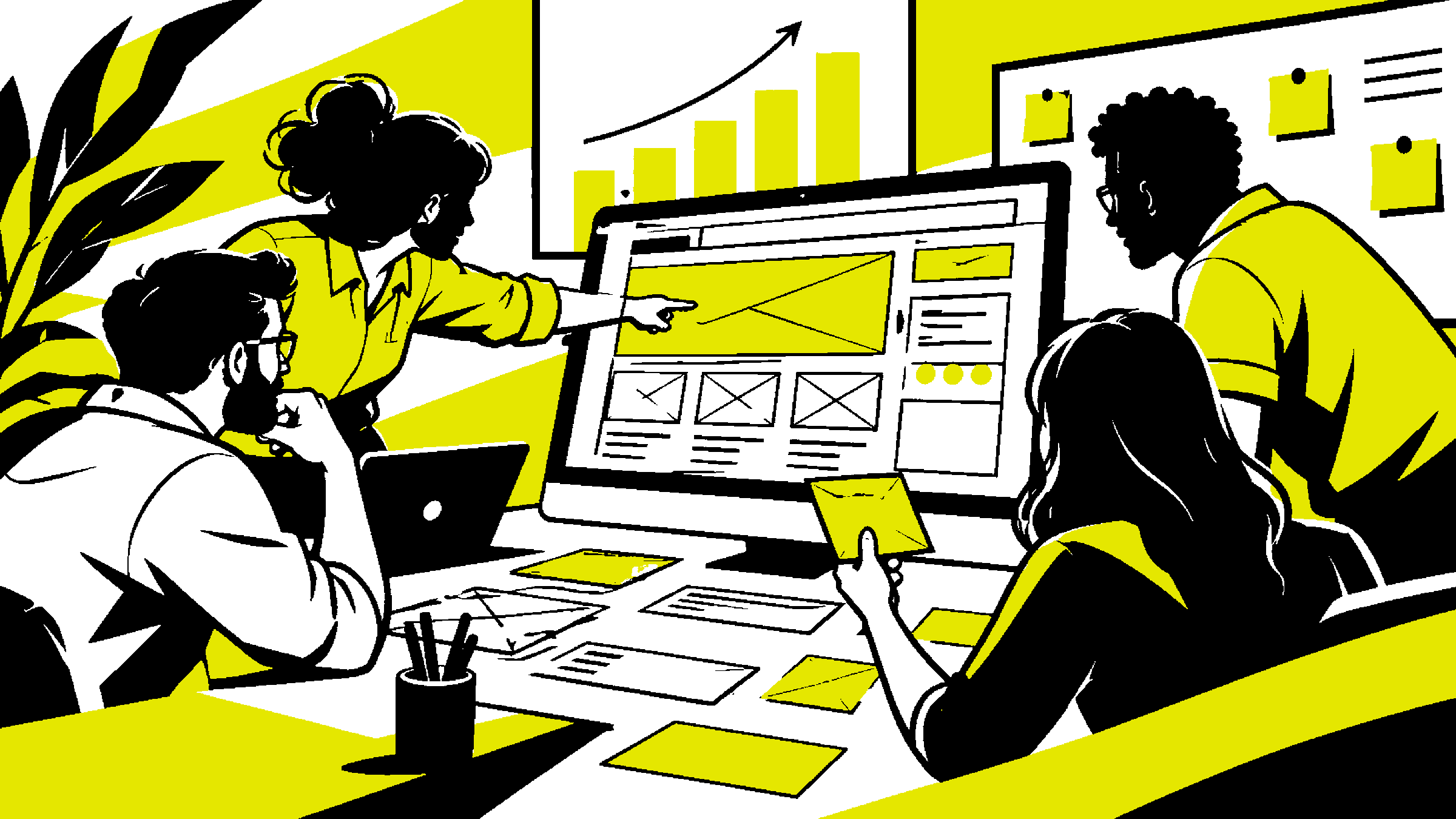
All this information was translated into layout work by conducting a massive wireframing effort to create the first visual structure of the pages. This file was presented and refined several times between the heads and directors, reaching more than 21 different versions.
Once we were satisfied with the result, the design phase began in Figma, starting with the creation of the project’s style guide, based on the new brandbook recently developed by the advertising agency.
The design aimed to be innovative, elegant, and modern. We selected a color palette with a striking contrast color—yellow—paired with a charcoal gray base to ensure the desired visual solidity and authenticity.
Finally, we focused on adapting all components, pages, and graphic elements for mobile, testing them across various screen sizes to guarantee a fluid and complete user experience on these devices.
The implementation was done using React + Tailwind + Styled Components, along with an open-source CMS platform to simplify content and article creation. The site was also integrated with an external job platform using our own custom design, preventing any visual disruption in the user experience.
Impact
The optimization and taxonomy work applied to the Figma components allowed for fast website development. Since this was an internal project, we experimentally used design tokens integrated directly into the React code, enabling design adjustments to propagate to the codebase without refactoring components. This gave the team hands-on experience to apply the same approach to client projects.
The development timeline was a company record. Within less than four months from the start of the discovery phase, we completed the first deployment for testing and validation.
Thanks to the code refactoring effort, adoption of a new stack, and focus on SEO and accessibility improvements, the number of visits to the company website increased by more than 120% in the first month after launch and continued to grow steadily throughout the year.
Learn more at https://www.platformbuilders.io/