DiFérias: Nautical Marketplace Discovery and Design
A two-sided nautical marketplace in the Lençóis Maranhenses: discovery with canvas and JTBD, visual identity, the booking journey and automatic payout to the boat owner.
- Client
- DiFérias
- Year
- 2023
- Categories
- UI / Product Design
A two-sided marketplace in the Lençóis region
DiFérias is a platform for renting speedboats, boats and nautical experiences around the Lençóis Maranhenses, with bases in Barreirinhas, Atins and Santo Amaro. The product connects people who want a boat trip with people who have a boat to rent, so it has to work for two audiences at the same time: the traveller who books and the owner who lists and gets paid. The home page publishes 50 destinations, more than 200 offers and more than 5 thousand customers.
I was responsible for discovery, design and the implementation of the platform, and I still keep the product running. The first cycle was a POC, recorded in the assessment with the decision to continue through iteration in flow. The live platform is what came next, and it is what this case documents.
The problem has four points of friction, not one
The launch material lists what travellers face when they reach the pier: negotiating price, time and boat without knowing exactly what they are hiring; uncertainty about availability and departure time; missing real photos and missing information about the boat; and payment friction, with little safety in the booking.
On the other side of the marketplace there is a symmetrical and less visible problem: boat owners with idle assets out of season, with no reliable sales channel and no occupancy forecast. A product that only solves the traveller's search does not solve the marketplace, because supply has to be sustainable for the people who list.
Discovery: assessment, JTBD and flow
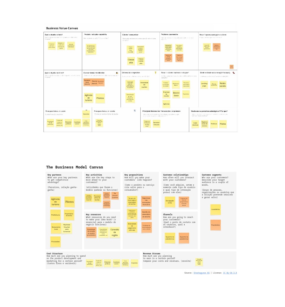
The work started with two canvases filled in during the Disruption Lab cycle: a Business Value Canvas, which defined goal, audience, problem and differentiators, and a Business Model Canvas, which structured partners, activities, value proposition, channels, costs and revenue.
Next came the Jobs to be Done mapping, with the customer profile on one side and the value map on the other. What was recorded there:
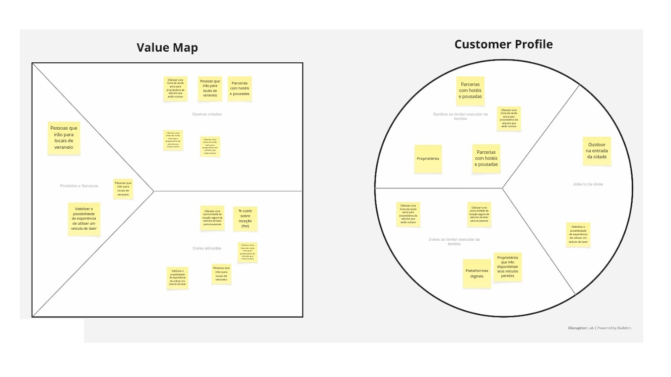
Jobs: people heading to holiday destinations, owners making idle vehicles available, and partnerships as a distribution path.
Pains: owners with idle assets who want to monetise them, and people without safe access to leisure vehicles.
Expected gains: extra summer fleet for owners, safe rental for travellers, and a real chance to try the boat before renting.
Revenue model: a charge on top of the rental, with the fee recorded as an initial hypothesis in the JTBD itself.
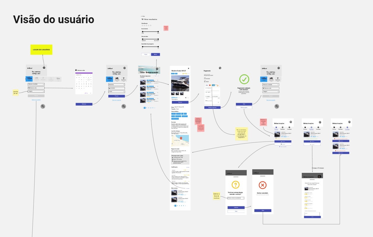
Closing the discovery cycle, I produced the user flow wireframes, covering search, filters, detail, booking, payment, booking management, cancellation and review.
The brand before the interface
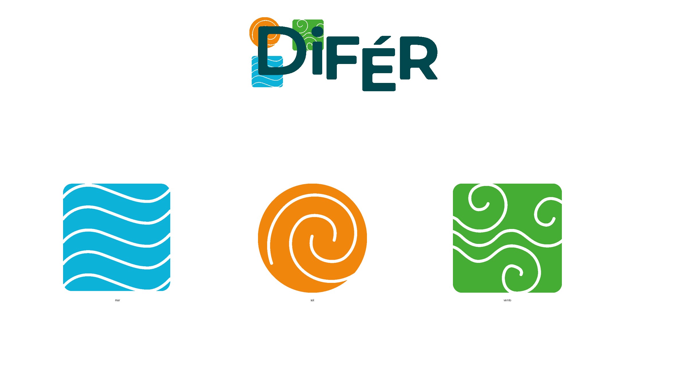
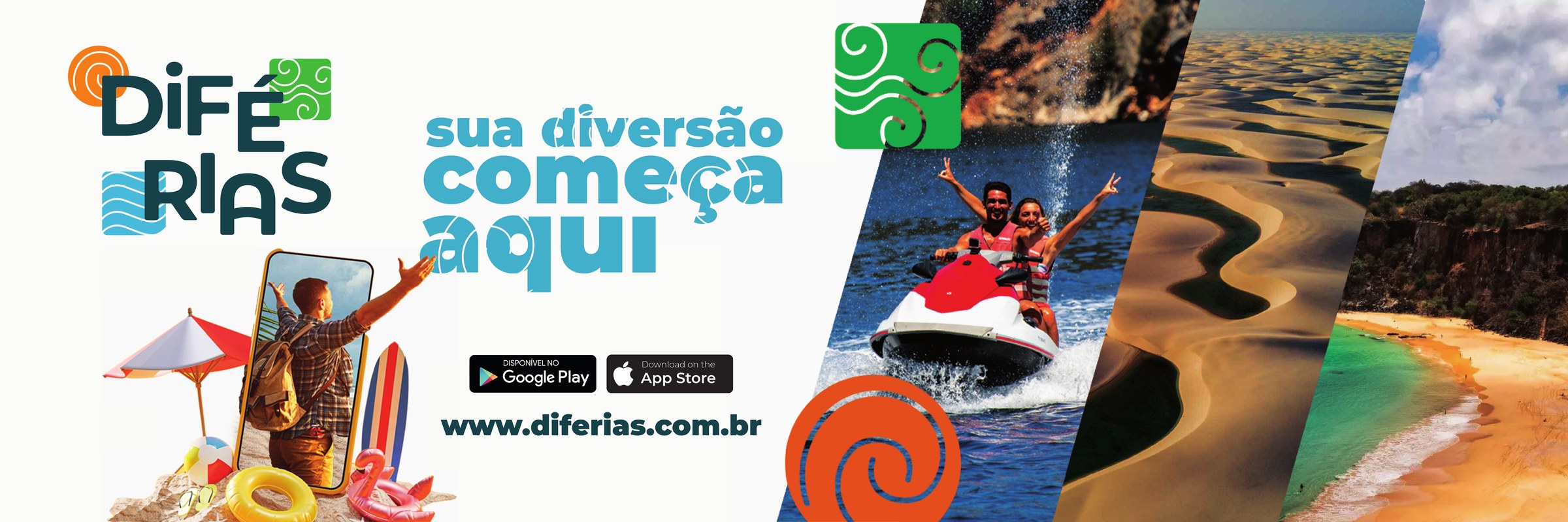
A marketplace for experiences sells trust before it sells a booking, so the visual identity was part of the product work, not a decorative stage. The system includes the logo in every variation the product needs (colour, dark, light and icon), three proprietary graphic elements (sea, sun and wind), a photo bank of the region and the physical applications: a 900 by 300 centimetre billboard, wind flags, a t-shirt and a flyer.
The hardest decision was about money
The part of the product that demanded the most care was not the search screen. It was the payout to the partner. A marketplace that charges the traveller and has to pay the boat owner carries a trust problem in both directions, and solving it outside the flow (agreed by phone, manual transfer, spreadsheet) destroys the operation as supply grows.
The implementation uses a subaccount per partner with automatic split. The design ended up like this:
Partner onboarding: signing up on the platform triggers the creation of the subaccount, and the partner receives a link where they confirm their data, upload a document and take a selfie, a regulatory requirement from the Central Bank. The analysis takes up to 48 hours, and the account moves through defined states: pending, under review, approved or rejected.
Split at charge time: the payout is configured when the charge is created, either as a percentage or a fixed amount. When the traveller pays, the gateway deducts its fee, works out the net amount and automatically credits the partner's share to their subaccount.
Regulatory contingency: during the evaluation period there are operating limits imposed by the Central Bank (a cap on subaccounts and a cap on charges per subaccount), which forced us to treat the partner approval queue as part of the product flow instead of a back office detail.
On the technical side, two rules went into the design: the subaccount key is returned only once and stays in the backend, and status updates arrive by webhook, with no repeated API polling.
The platform in production
The published product has five main surfaces, and each one answers a moment in the journey:
Home: hero with the proposition, offer showcase, destinations and social proof with operating numbers.
Search: list of offers with a persistent filter column.
Destination: a cut by region, for people who already know where they want to sail.
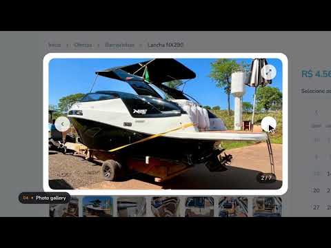
Offer: photo gallery, price per day, amenities and similar offers, which is where the decision happens.
Partner: benefits, how it works and testimonials, which is the entry door on the supply side.
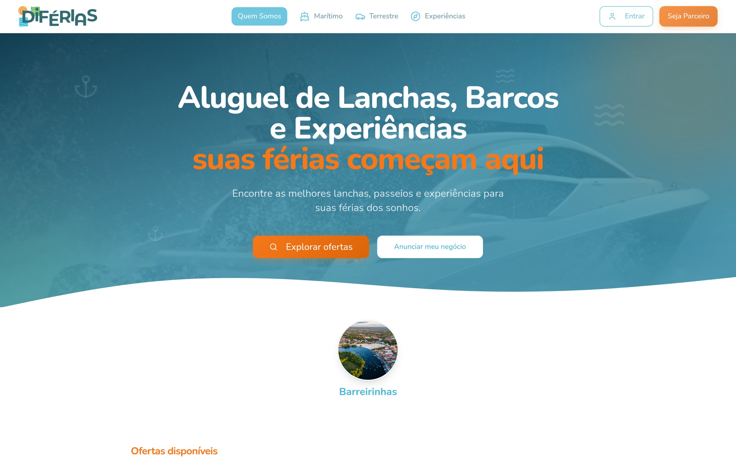
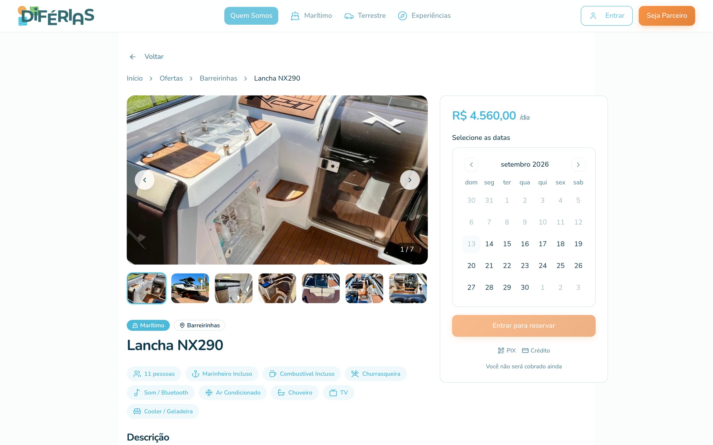
I built the site with Lovable on top of a component based design system, with consistent card, typography and spacing patterns across pages. Beyond the five surfaces, the product has home and offer in a mobile version, search, destination, the partner page and an institutional page.
The reel below walks through the product in use, from the home page to the offer page:
What this project changed in how I work
Design does not end at handoff. Because I still keep the product running, every interface decision comes back as operating feedback. That changes the bar: a screen that looks elegant but creates doubt in support does not pass.
Money is part of product design. Partner onboarding, payment split and approval status are experience flows, with states, messages and deadlines. Treating them as an engineering-only matter is the shortest path to a manual operation disguised as a platform.
The supply side needs as much care as the demand side. The partner page has the same job as the offer page: convince, explain and reduce perceived risk.
Trust is designed with concrete information. Real photos of the boat, amenities, price per day and a cancellation policy are what turn a negotiation at the pier into a booking.